Rockland Connected Creatives
Case study: the Field Print design system
How one design language holds a five-pillar platform together.
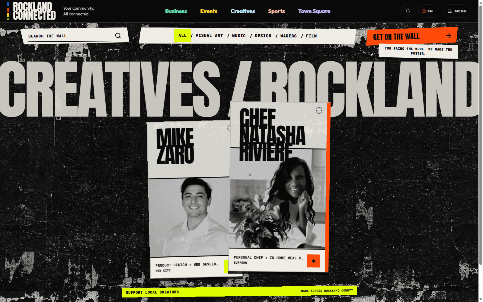
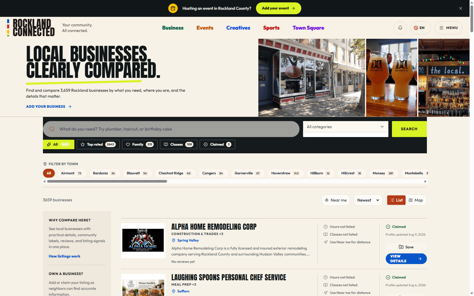
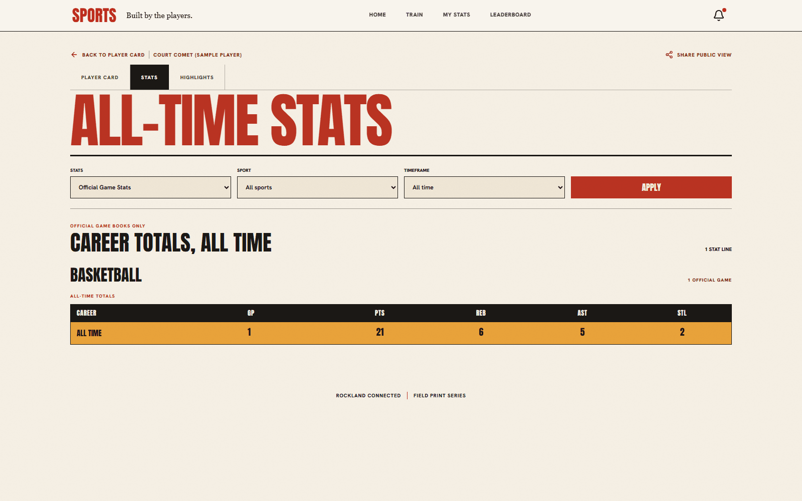
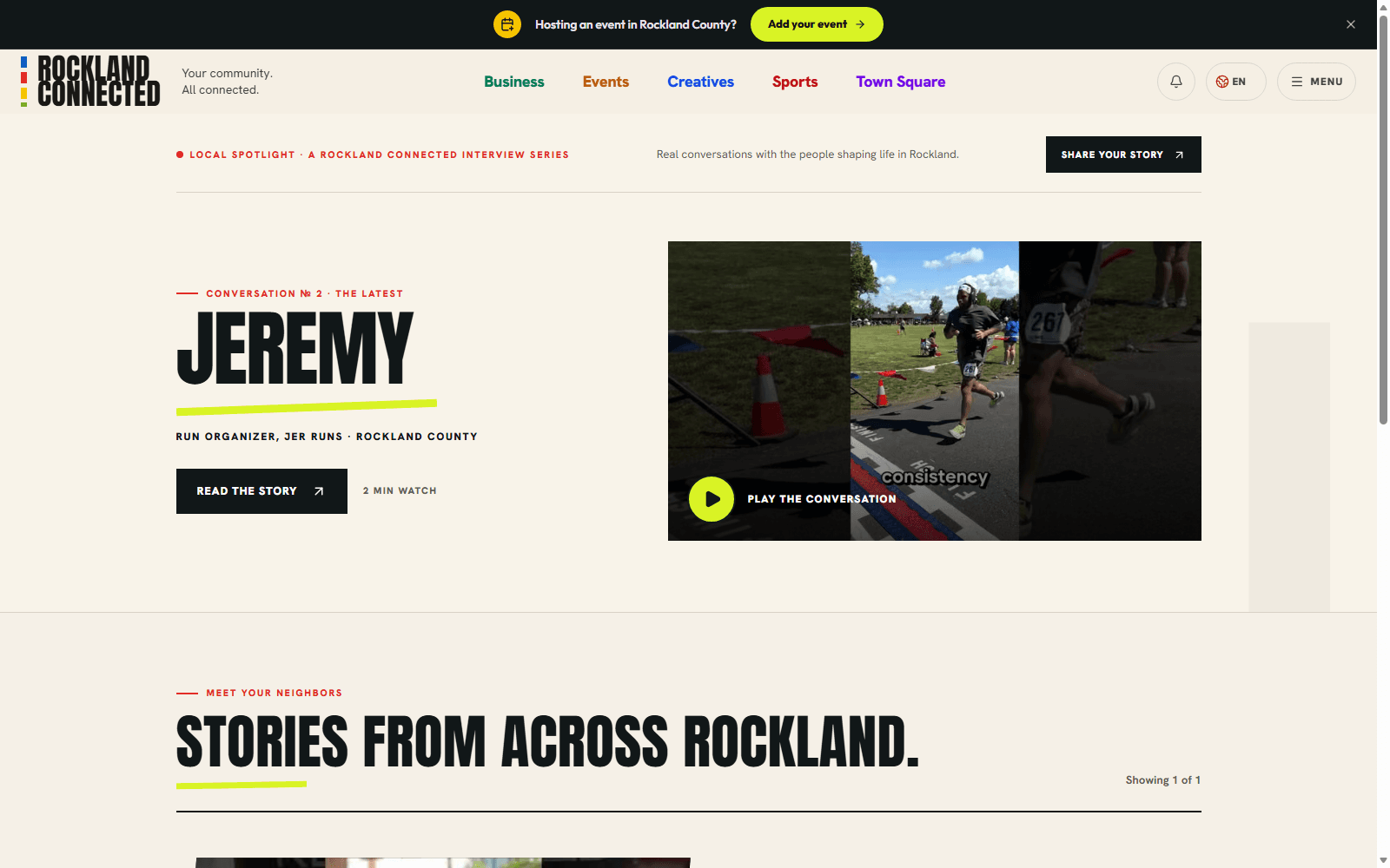
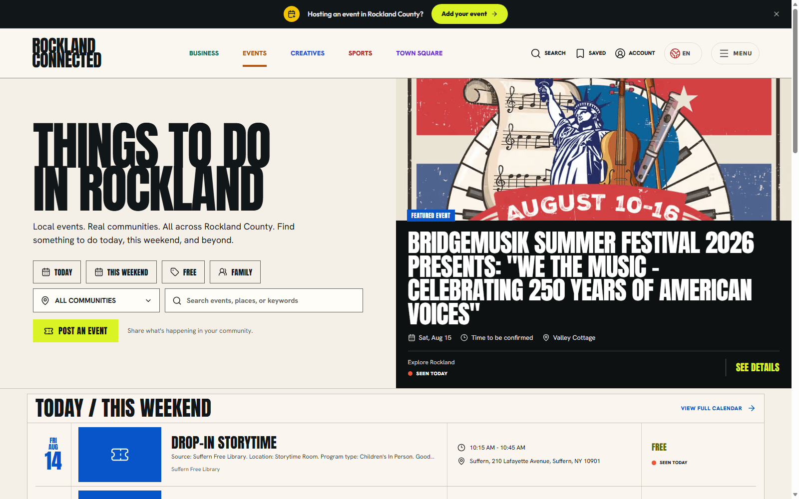
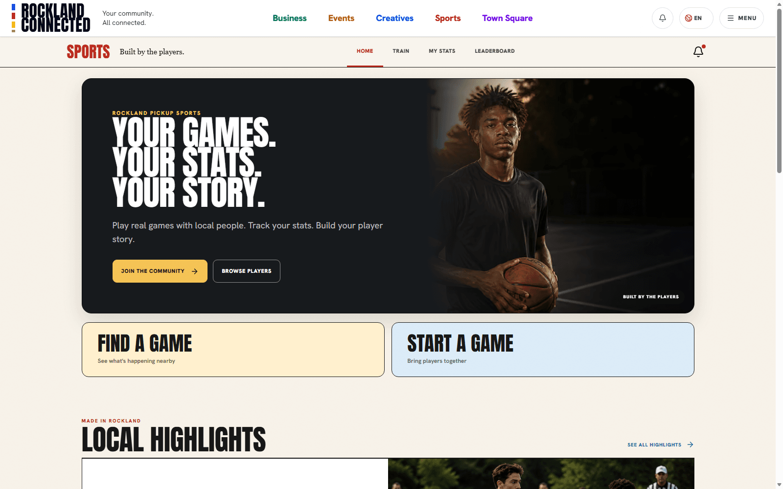
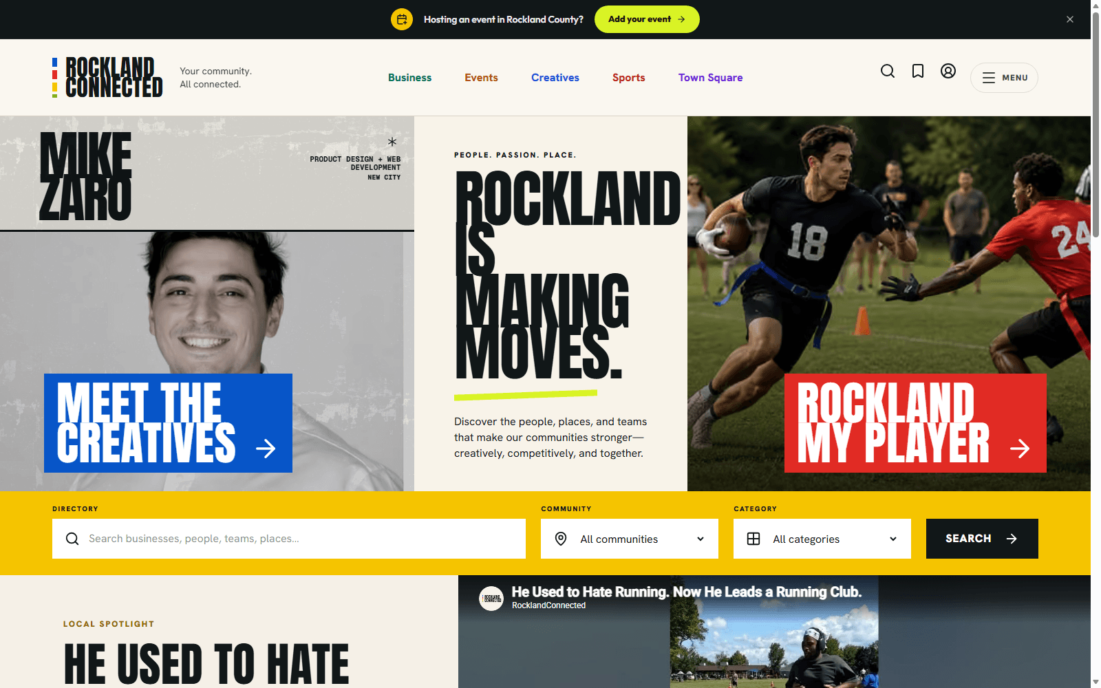
Most community sites look like software. Rockland Connected is designed to look like print - specifically, like the sports section of a great local paper that never existed. The system is called Field Print. The ingredients are deliberately few: Anton for headlines, set enormous and tight. Hanken Grotesk for everything you actually read. A cream paper background, ink-black rules, and one working red. Gold shows up only when something is a total - a career row, a final score. The constraint does the work. When a player's stat sheet, a business listing, and an interview all share the same bones, the platform reads as one place instead of five products. A new section does not need a new look; it needs a headline, a rule, and a reason to exist. The test we use for every screen: would this look right taped to the door of a deli? If yes, ship it. If it looks like a dashboard, start over.
Keep reading